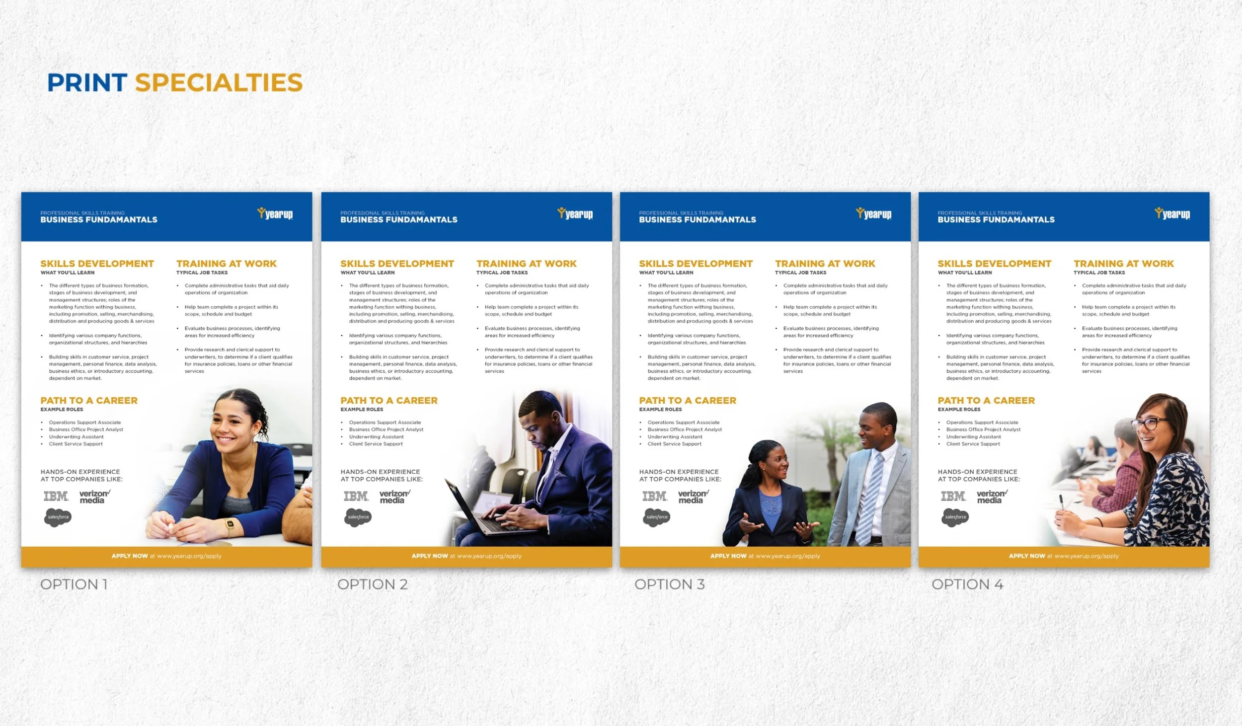
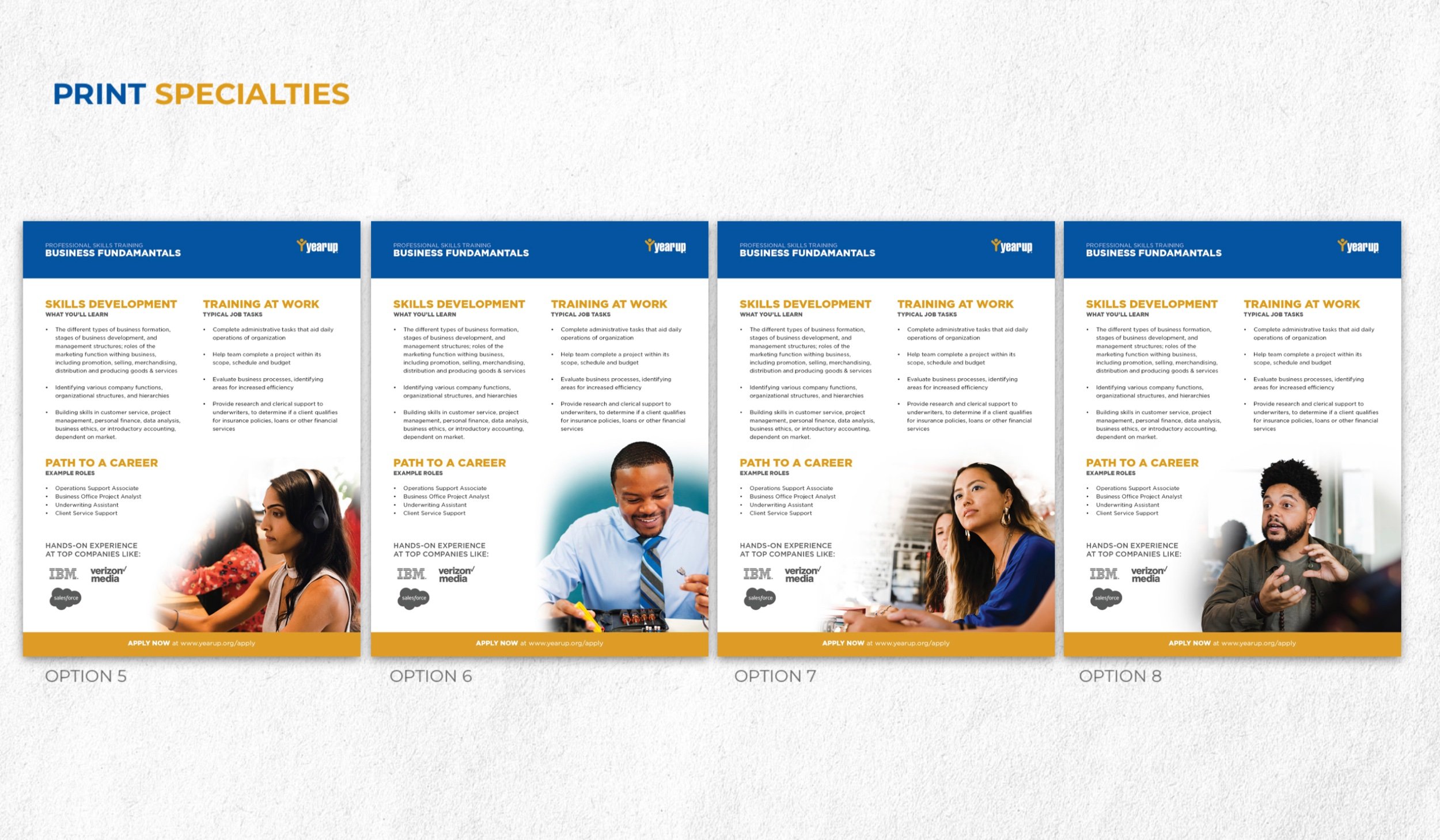
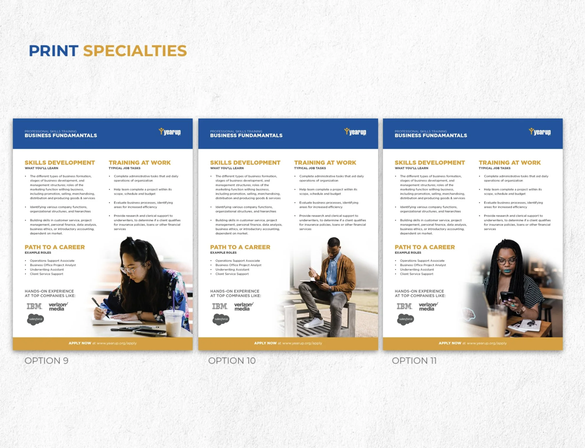
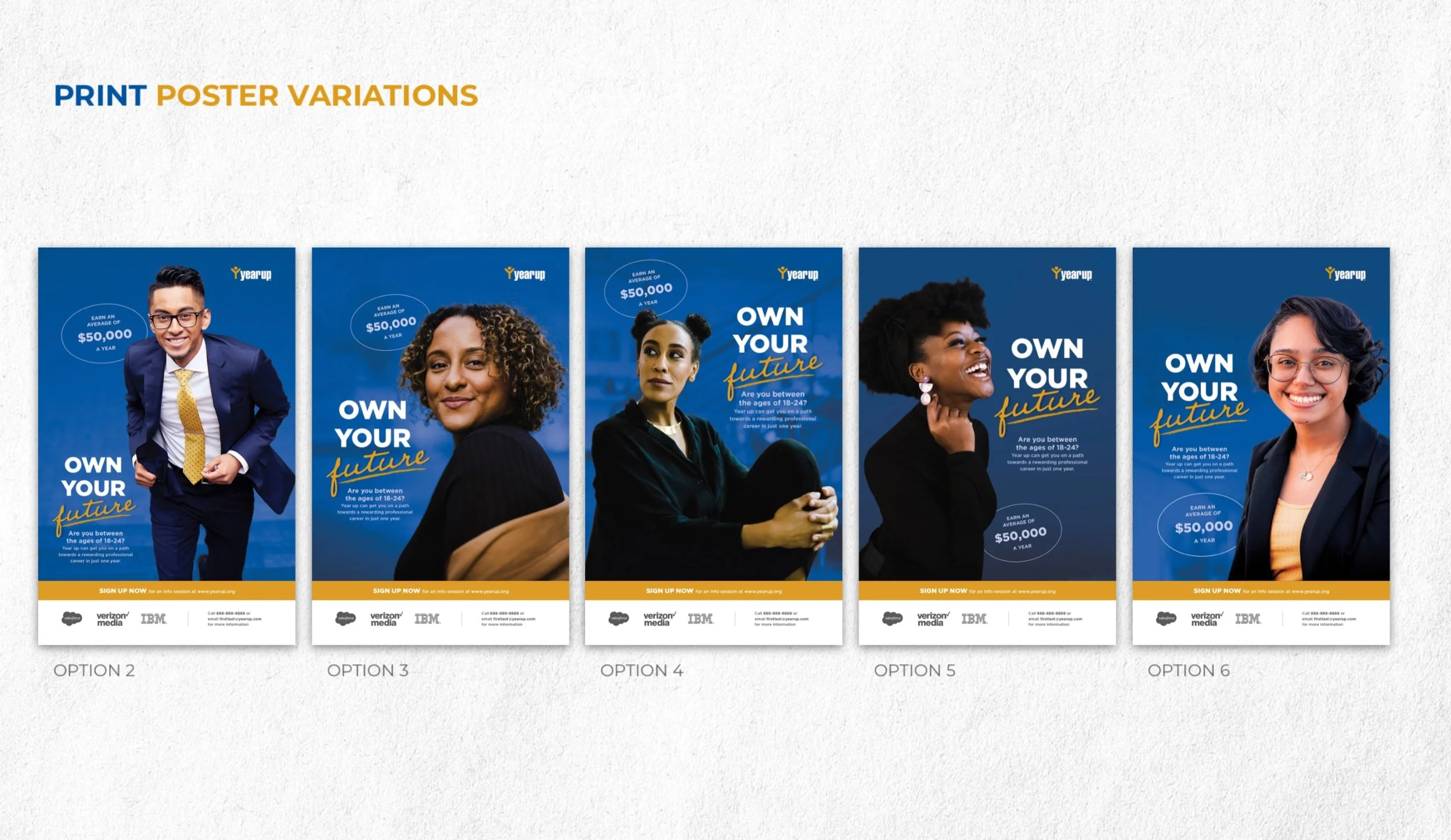
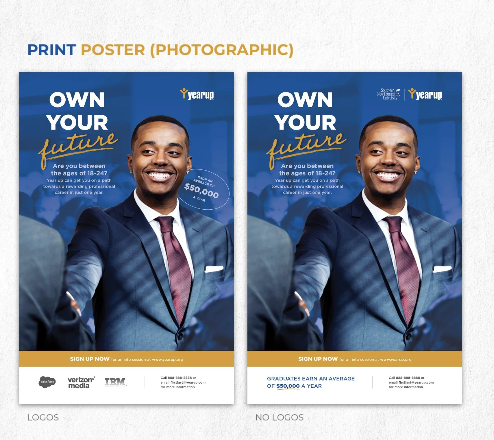
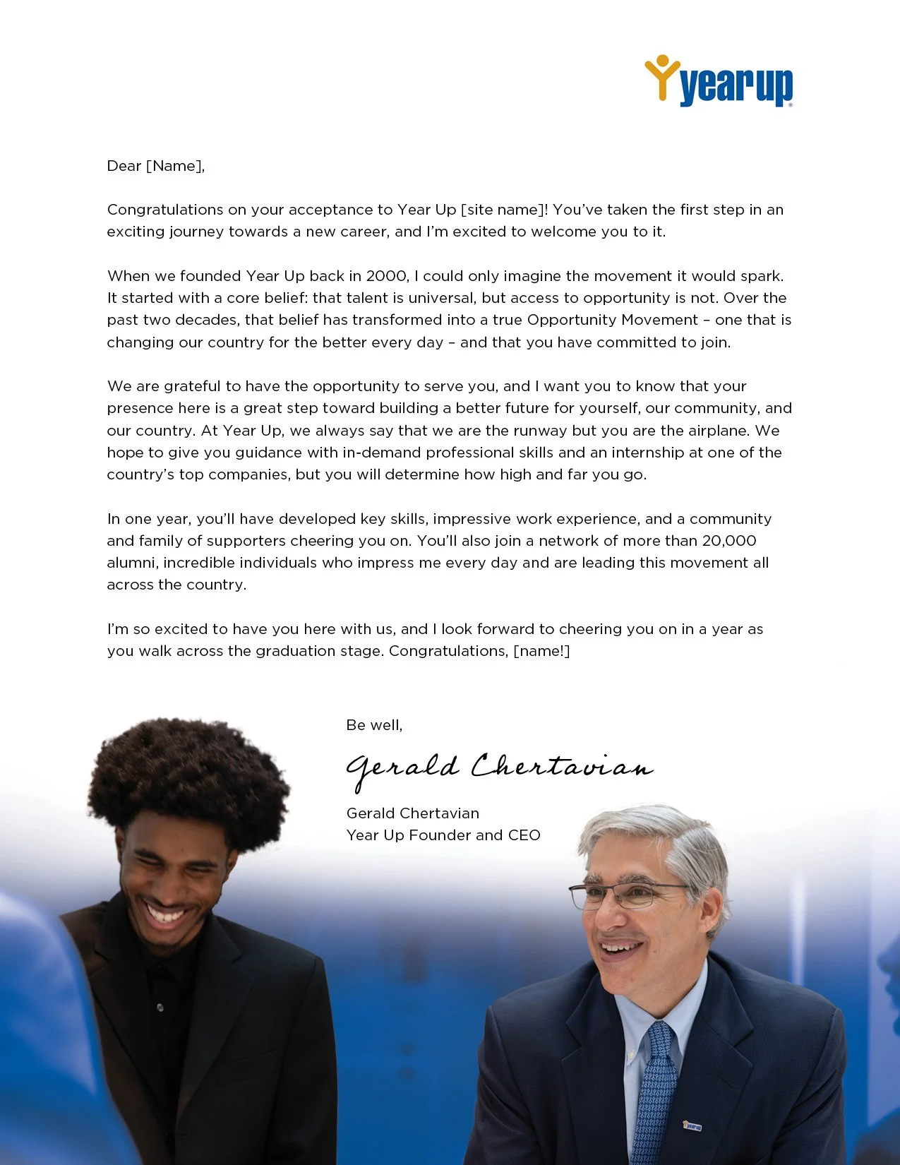
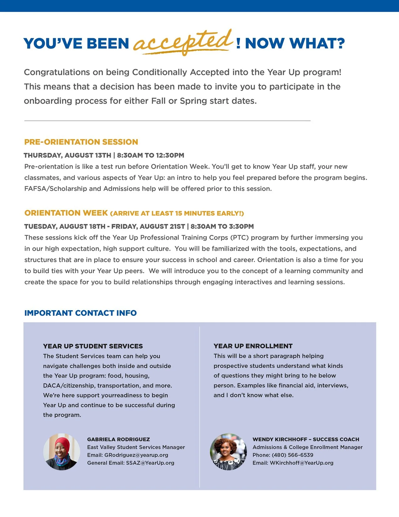
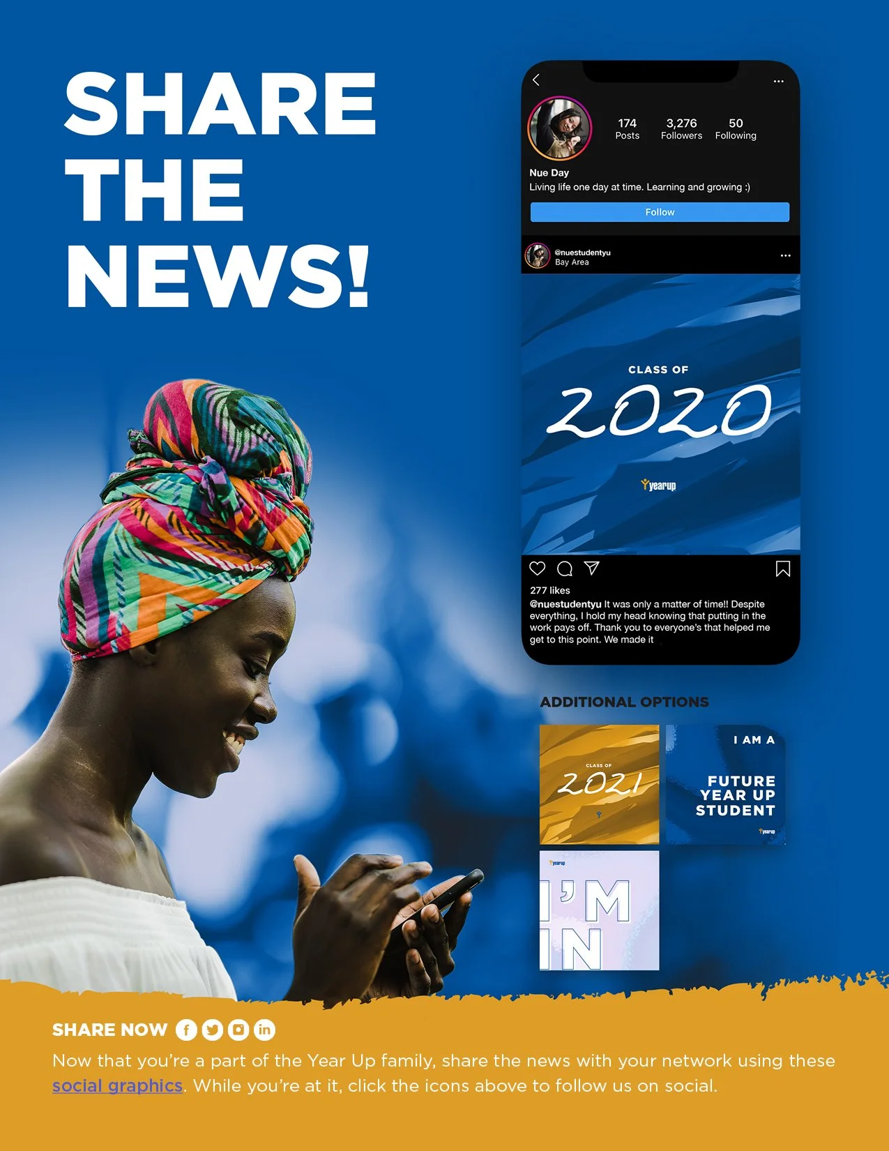
In an effort to close the professional Opportunity Divide, Year Up provides young adults with skills training, work experience, and support that empowers them to reach their potential through professional careers and higher education. Their model combines marketable job skills, stipends, internships and college level courses — a holistic approach focused on students’ professional and personal development, all to place young adults on a viable path to economic self-sufficiency.
The Ask
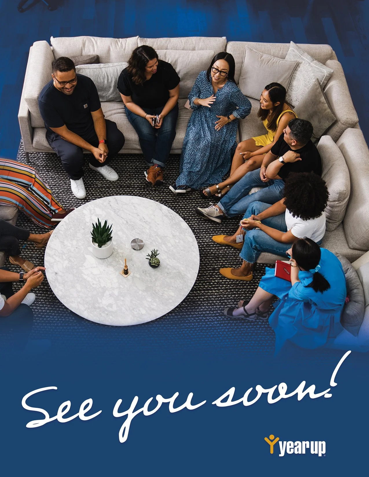
In 2019, the client reached out to me and a few other designers to submit a proposal for how I would redesign their recruitment. The visual direction and sample assets I shared were human-focused, meaning the highlight of each piece centers the people that embody YearUp’s community of focus. To keep things on brand, I led with YearUp Blue and reserved YearUp Gold for accents and emphasis.
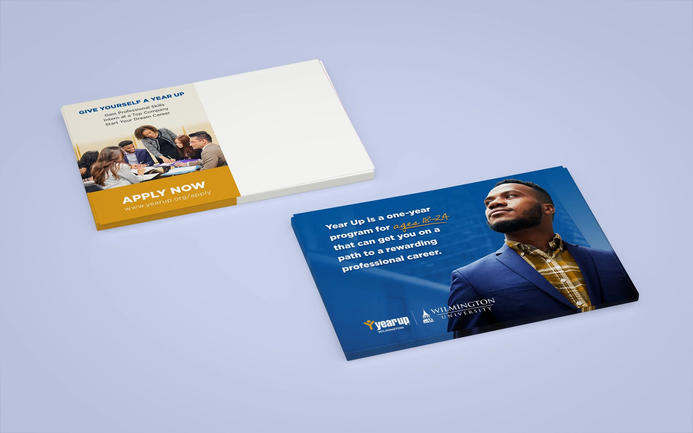
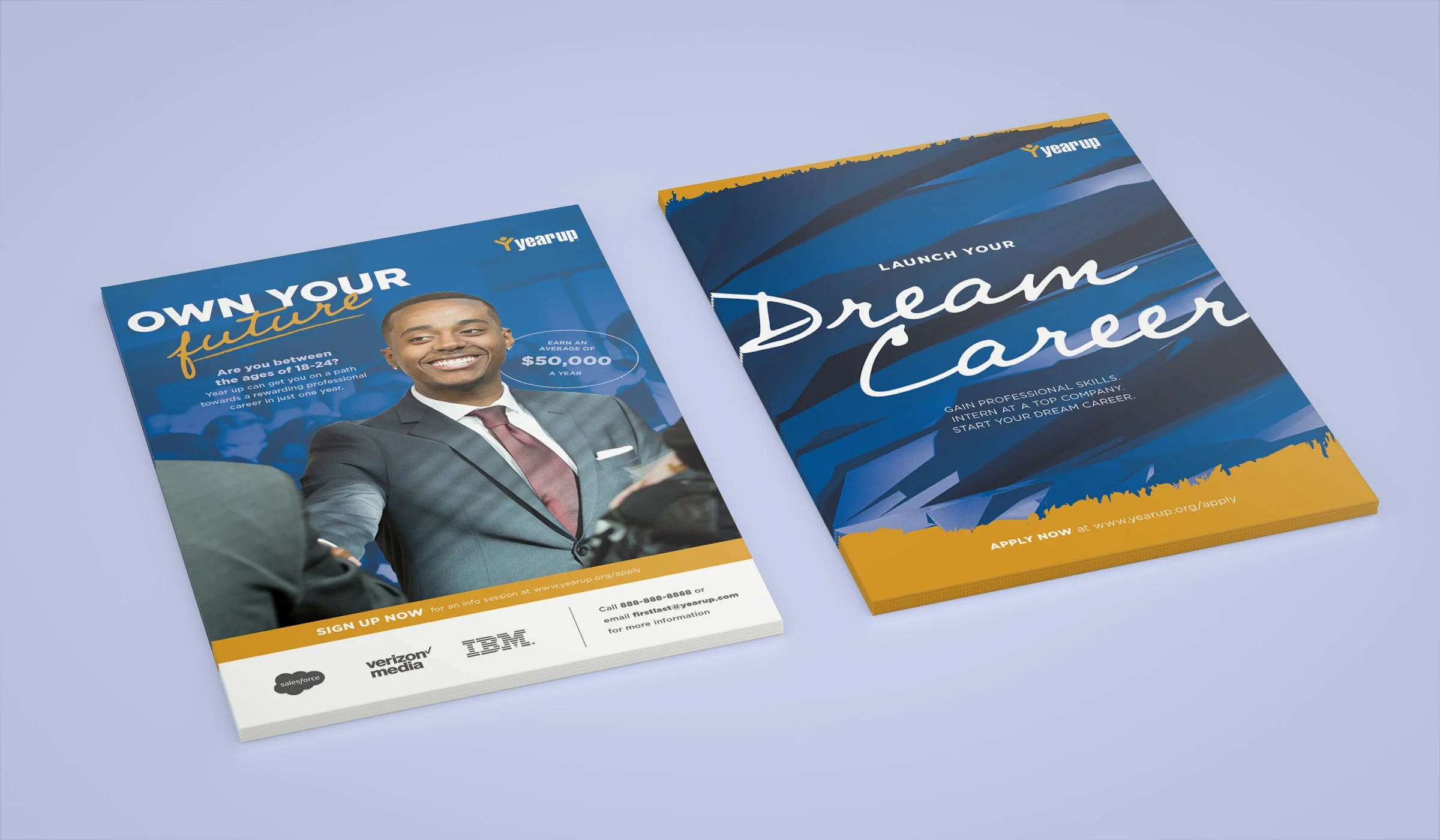
In 2020, I was tasked to help redesign Year Up’s recruitment suite. These materials would be distributed to their recruitment teams across 18 markets and the goal is to inspire and entice 18 to 24-year-old prospective students to join the program. In collaboration with the Year Up marketing team, I designed a combination of print and digital assets in two phases.
Phase 1
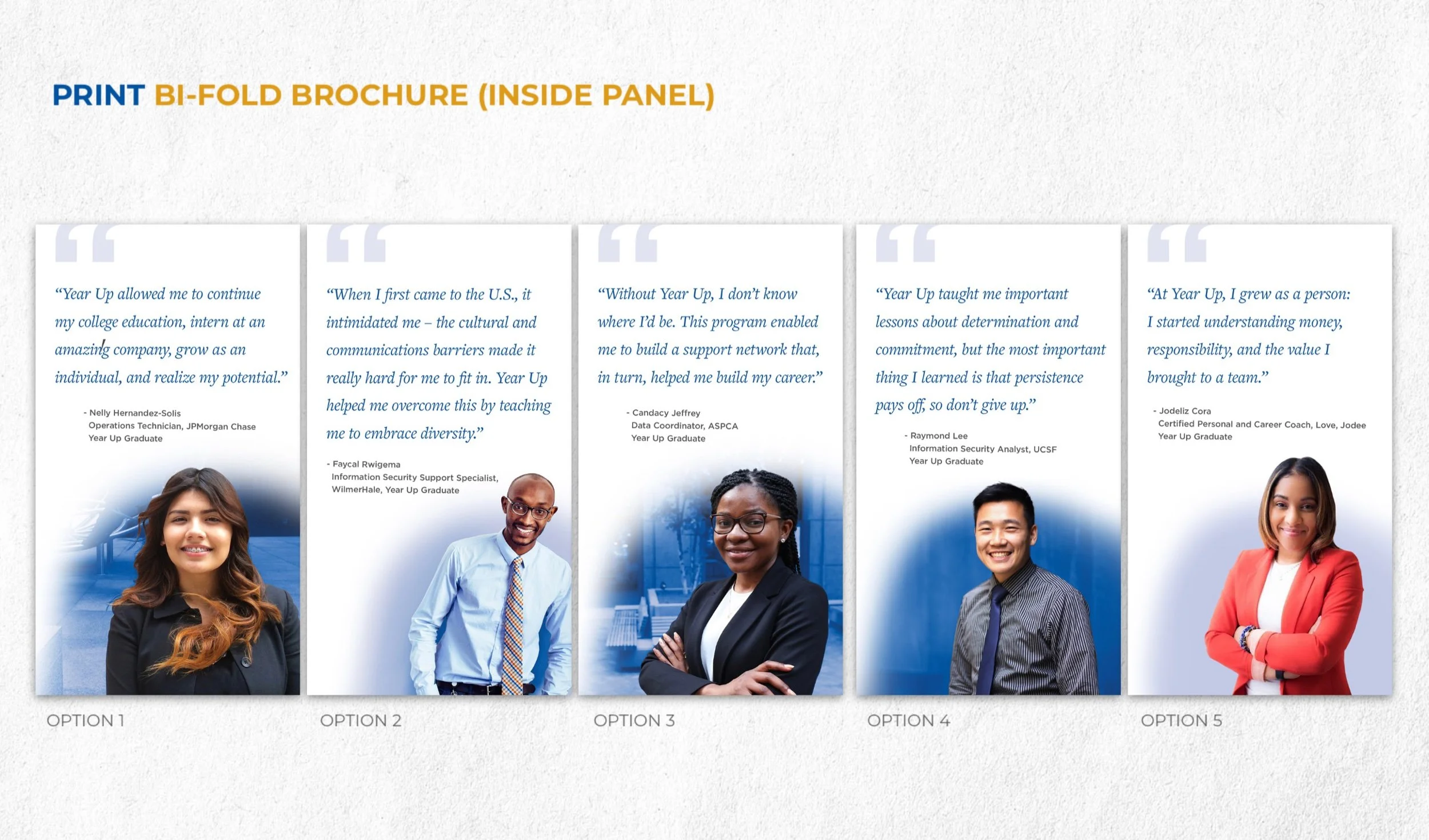
During this phase, we explored several iterations of each asset — all built out of the direction from my pitch. The client didn’t have photo assets of their own, so I compiled a list of photos for approval as well.
Phase 2
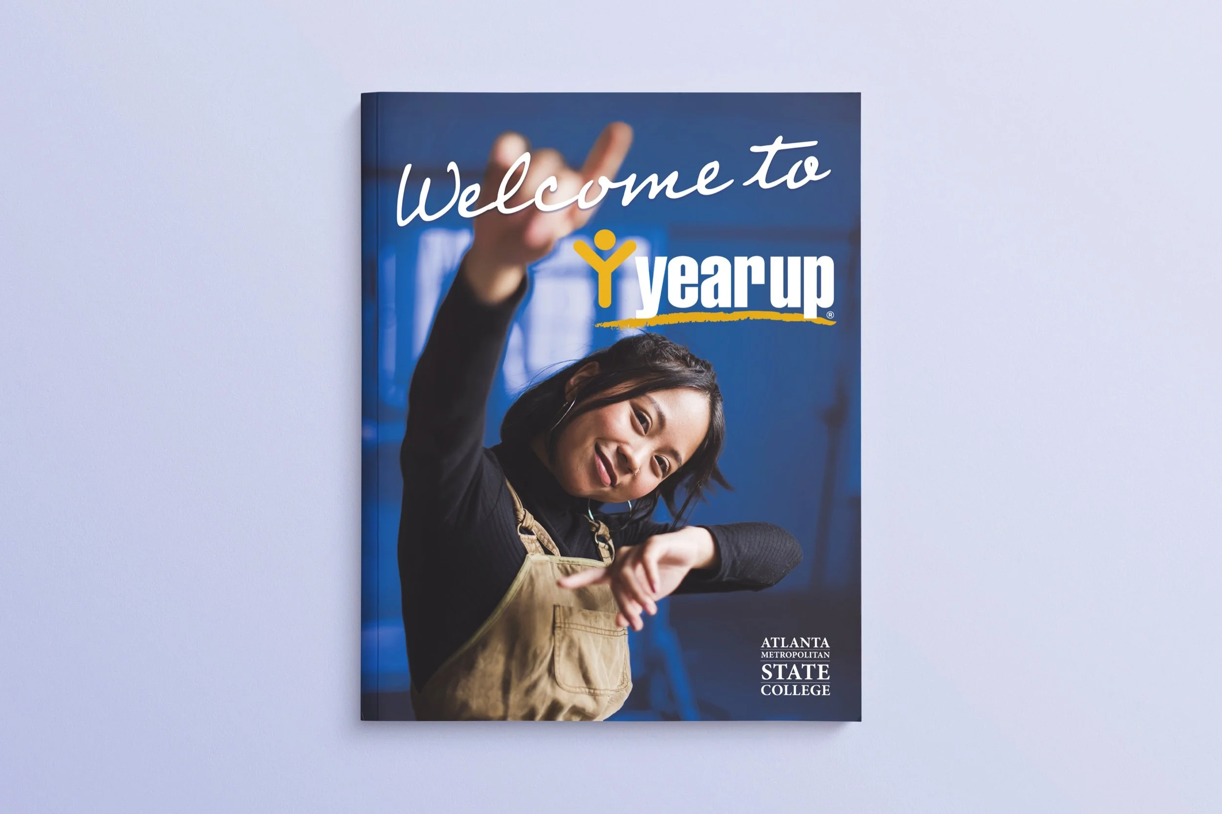
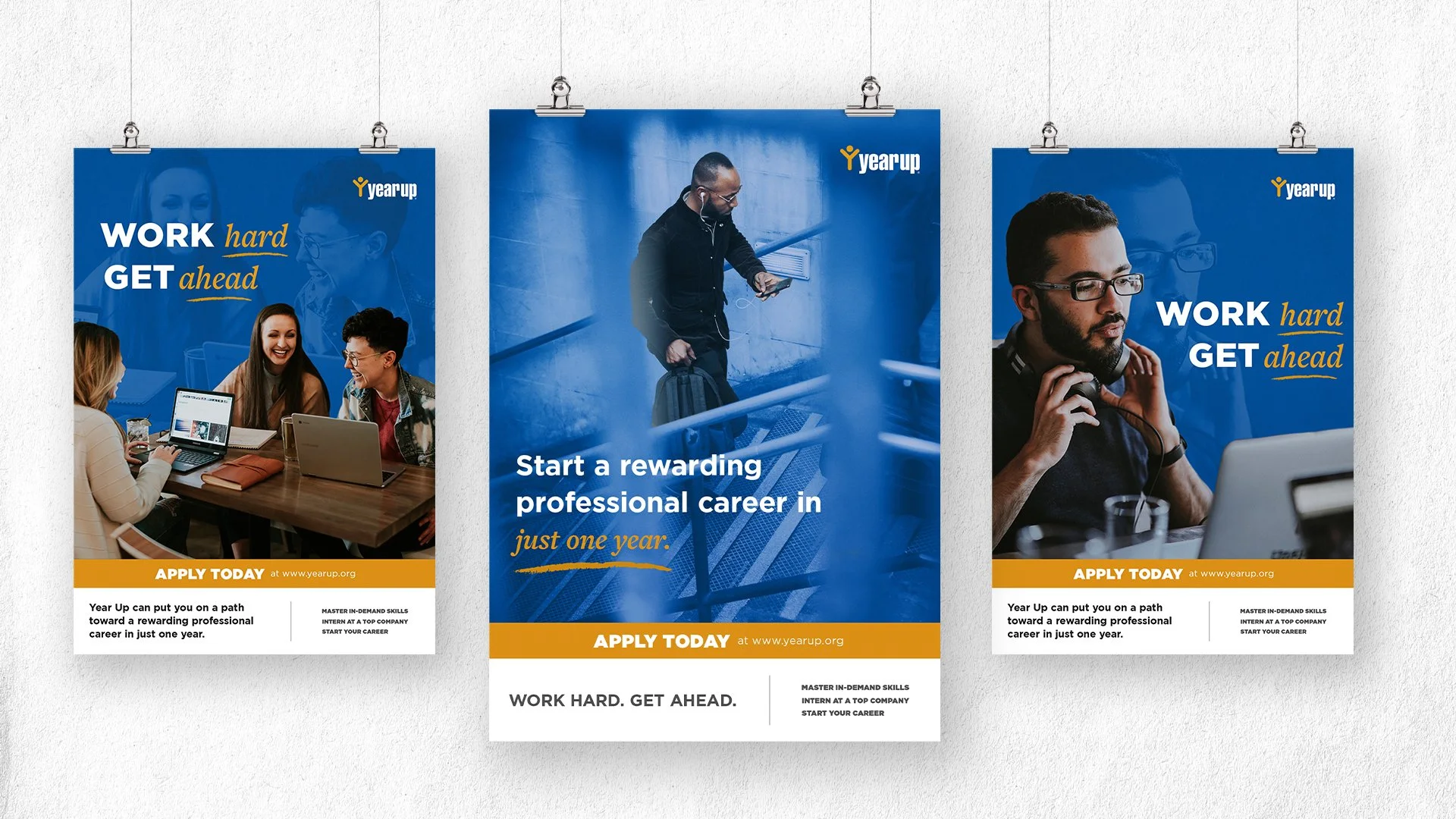
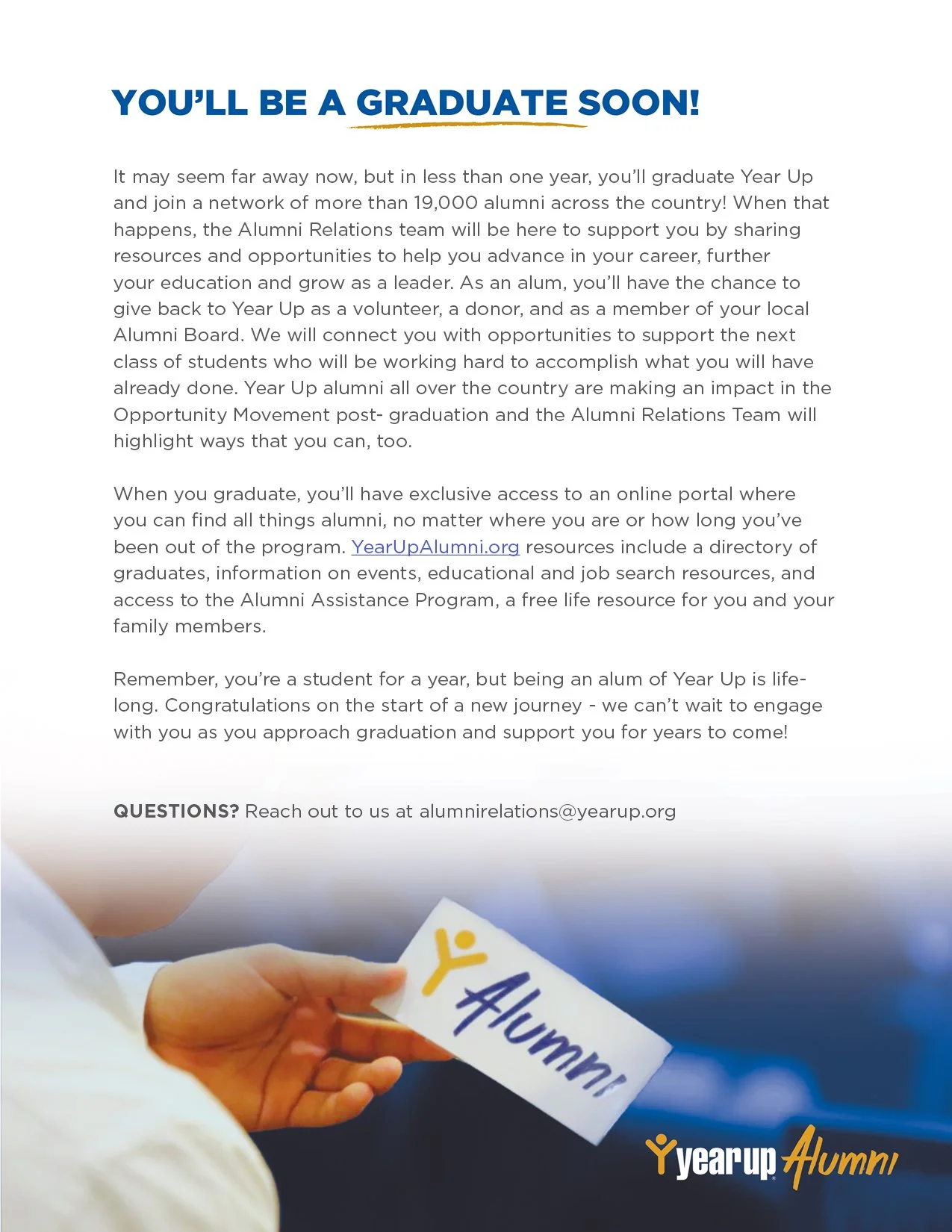
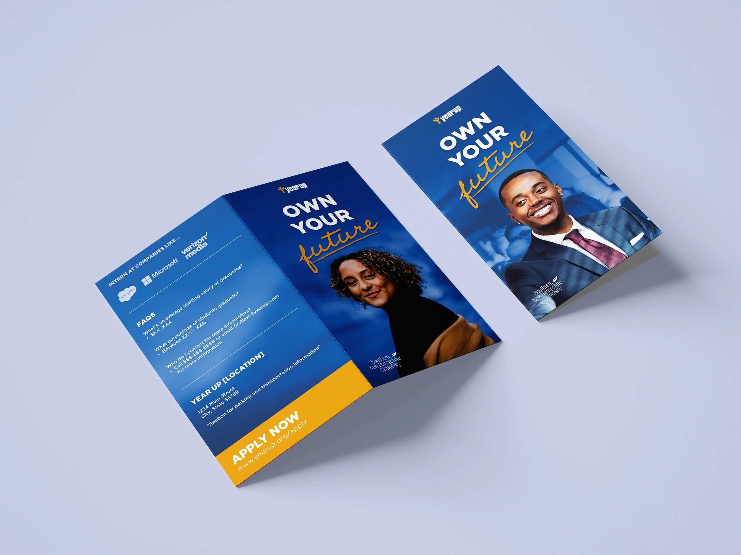
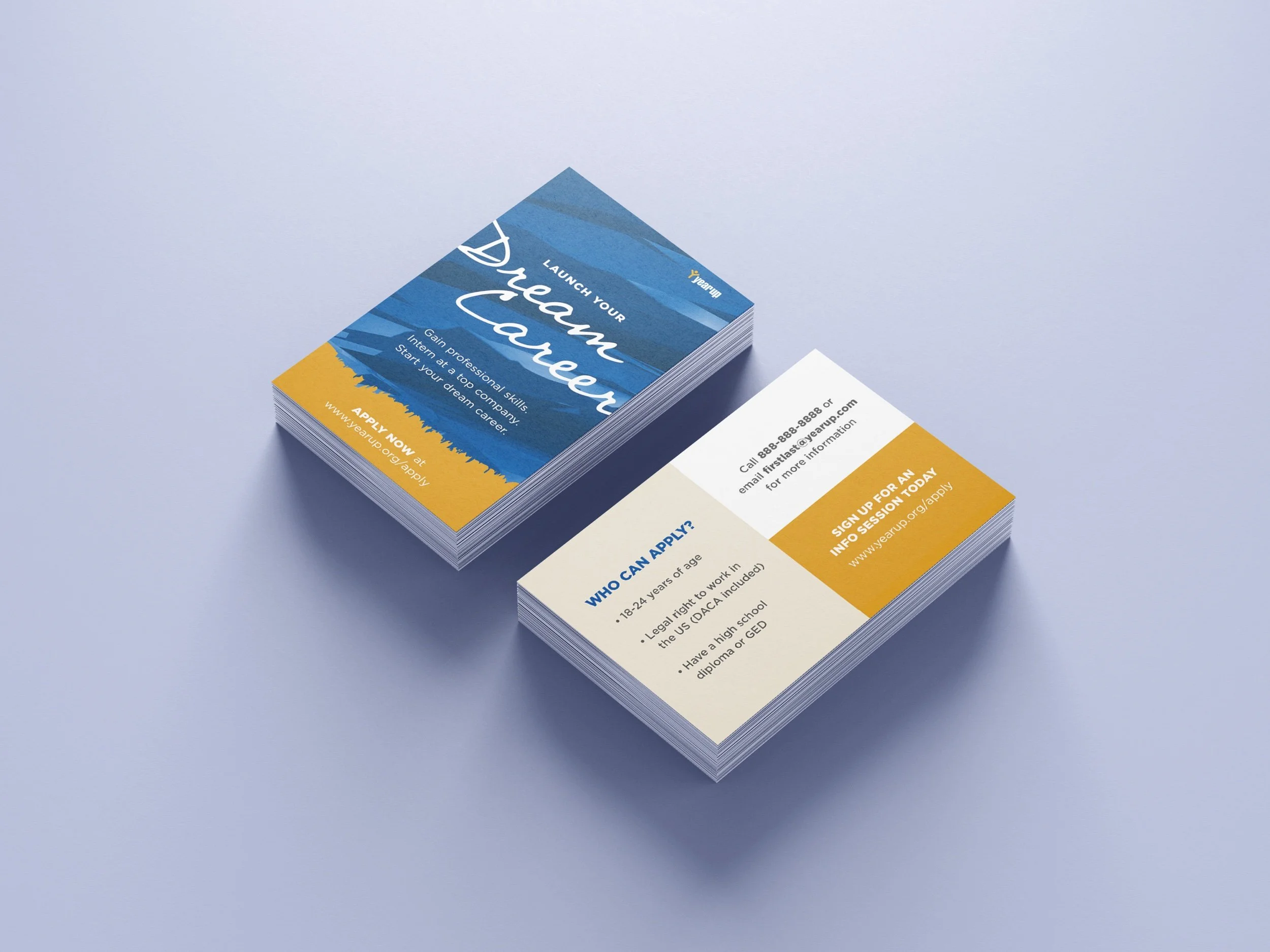
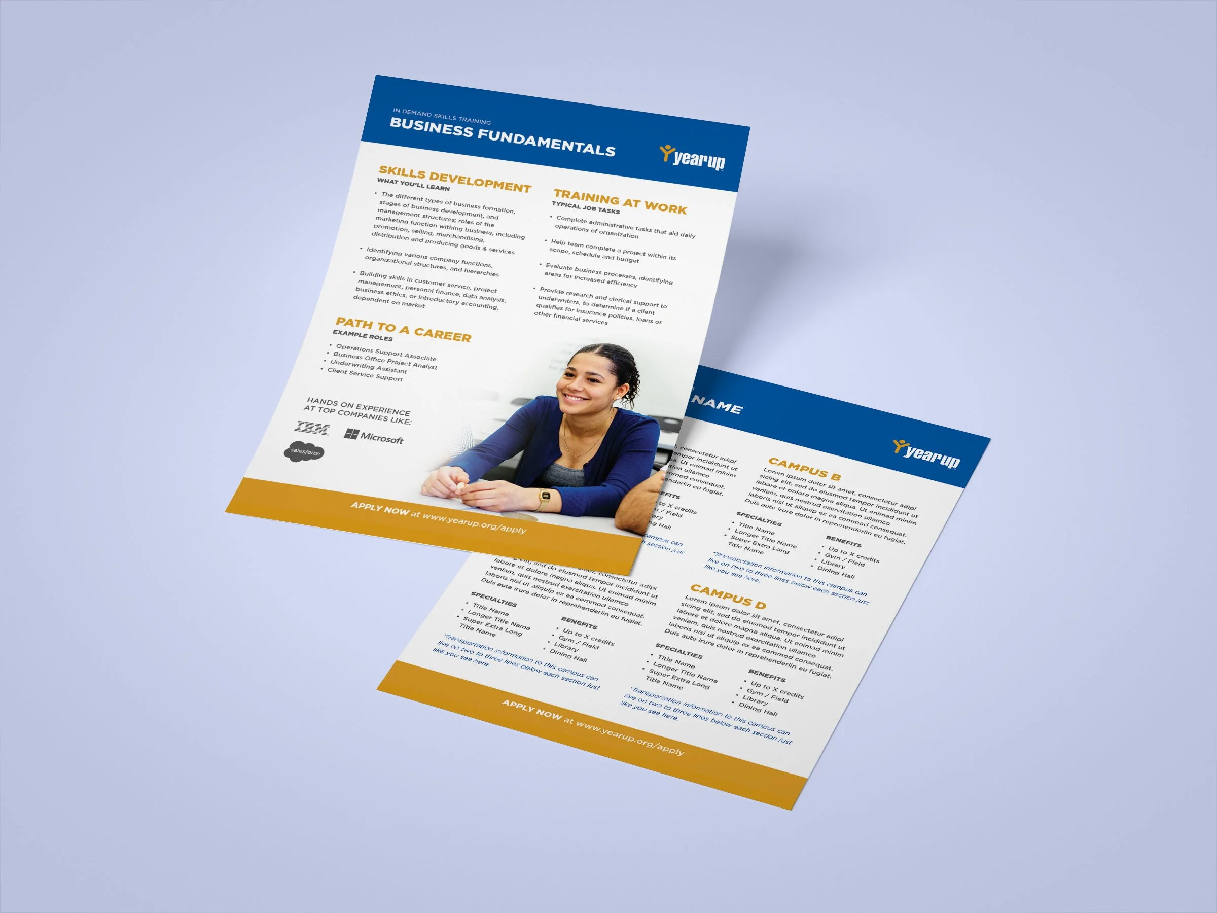
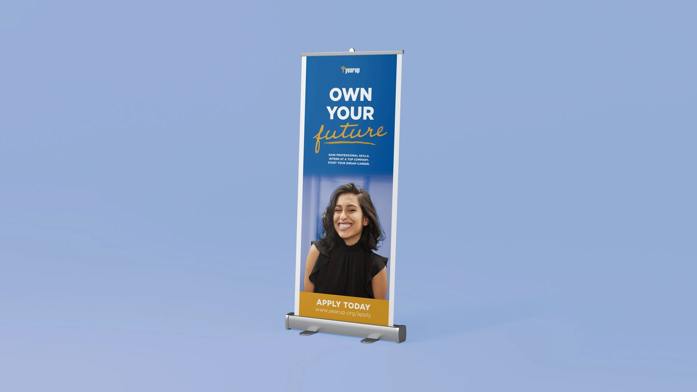
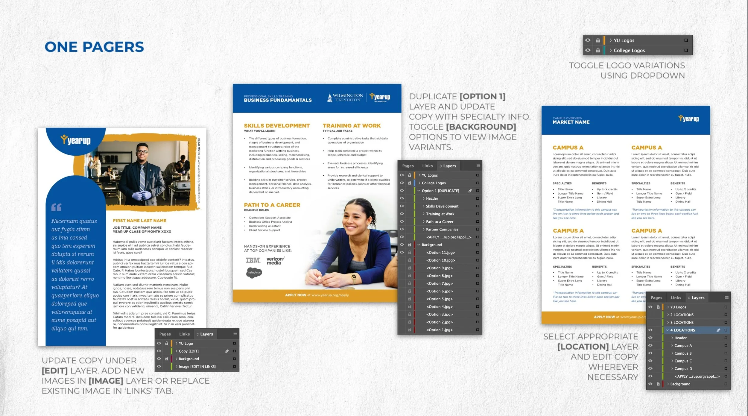
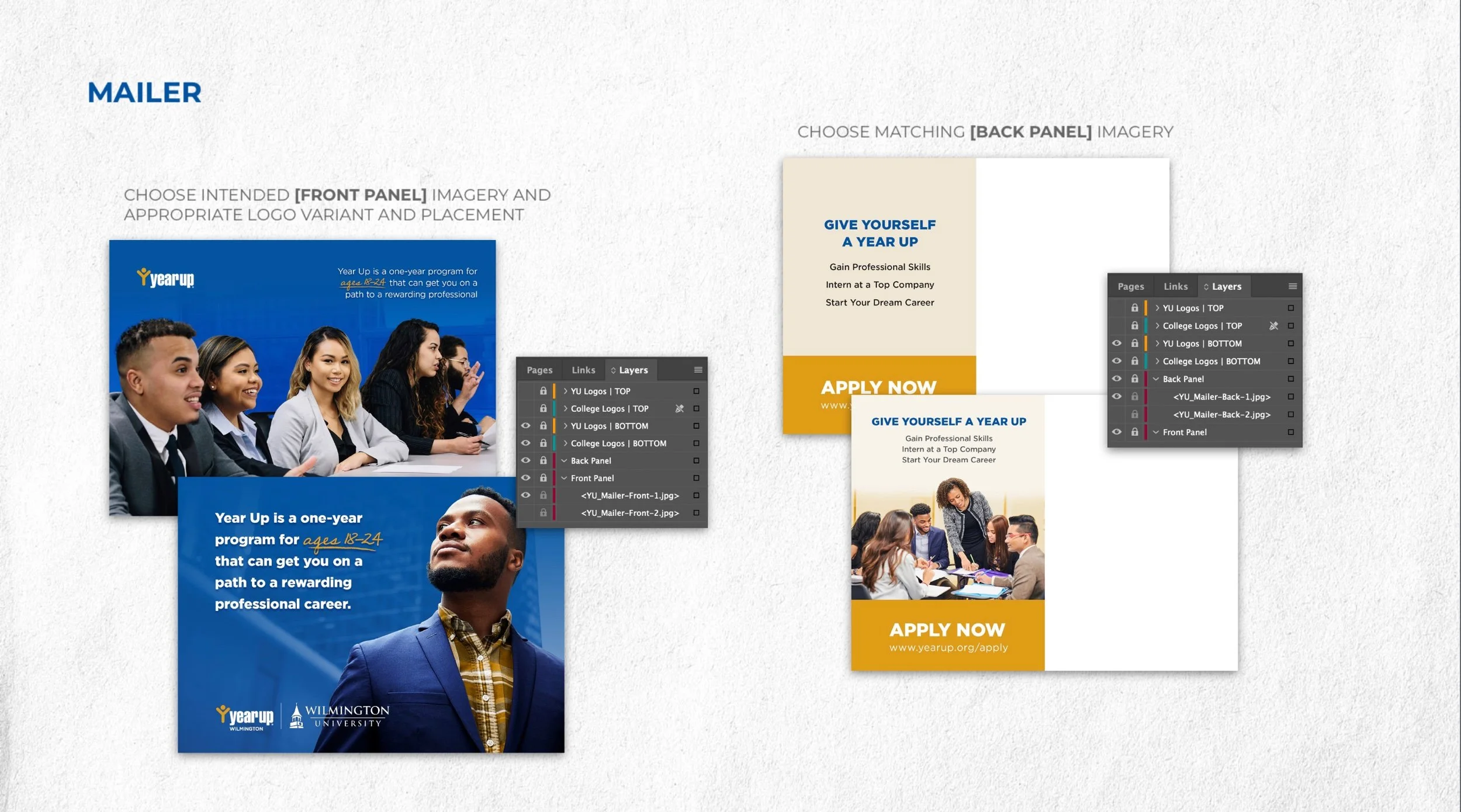
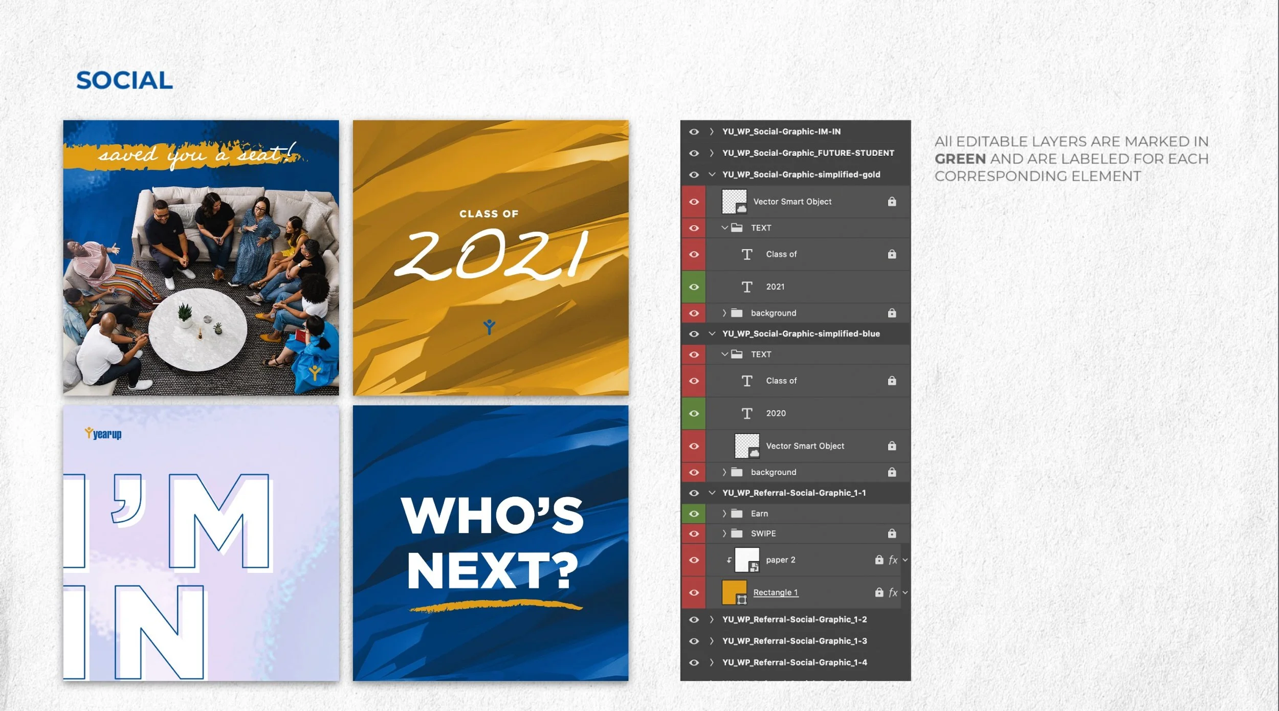
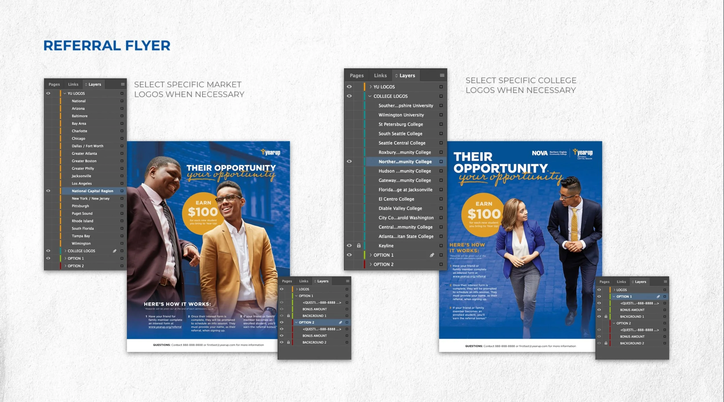
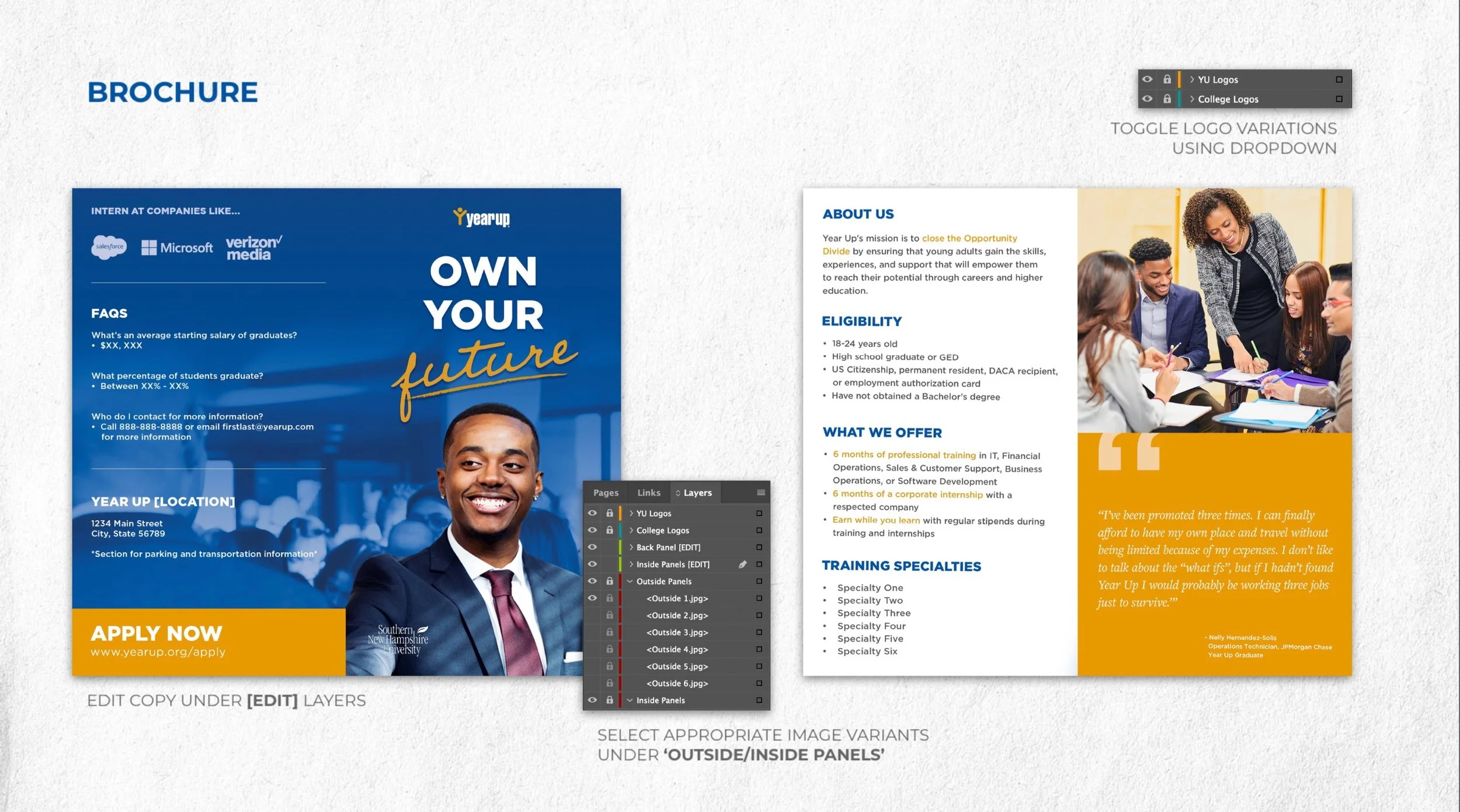
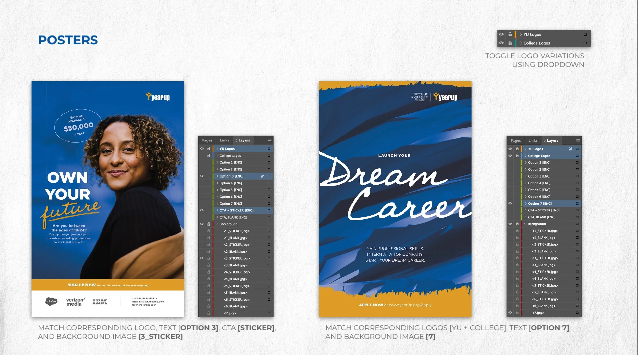
During this phase, I finalized a direction, copy, design and photo assets. I prepared each file for print (as needed) and presented an overview of all creative in a deck including notes and usage for each market. Ultimately we landed on a digital welcome packet, brochures, print/digital flyers, referral incentive flyers, one-pager, mailers, business cards, posters, pop-up banners, social media graphics.
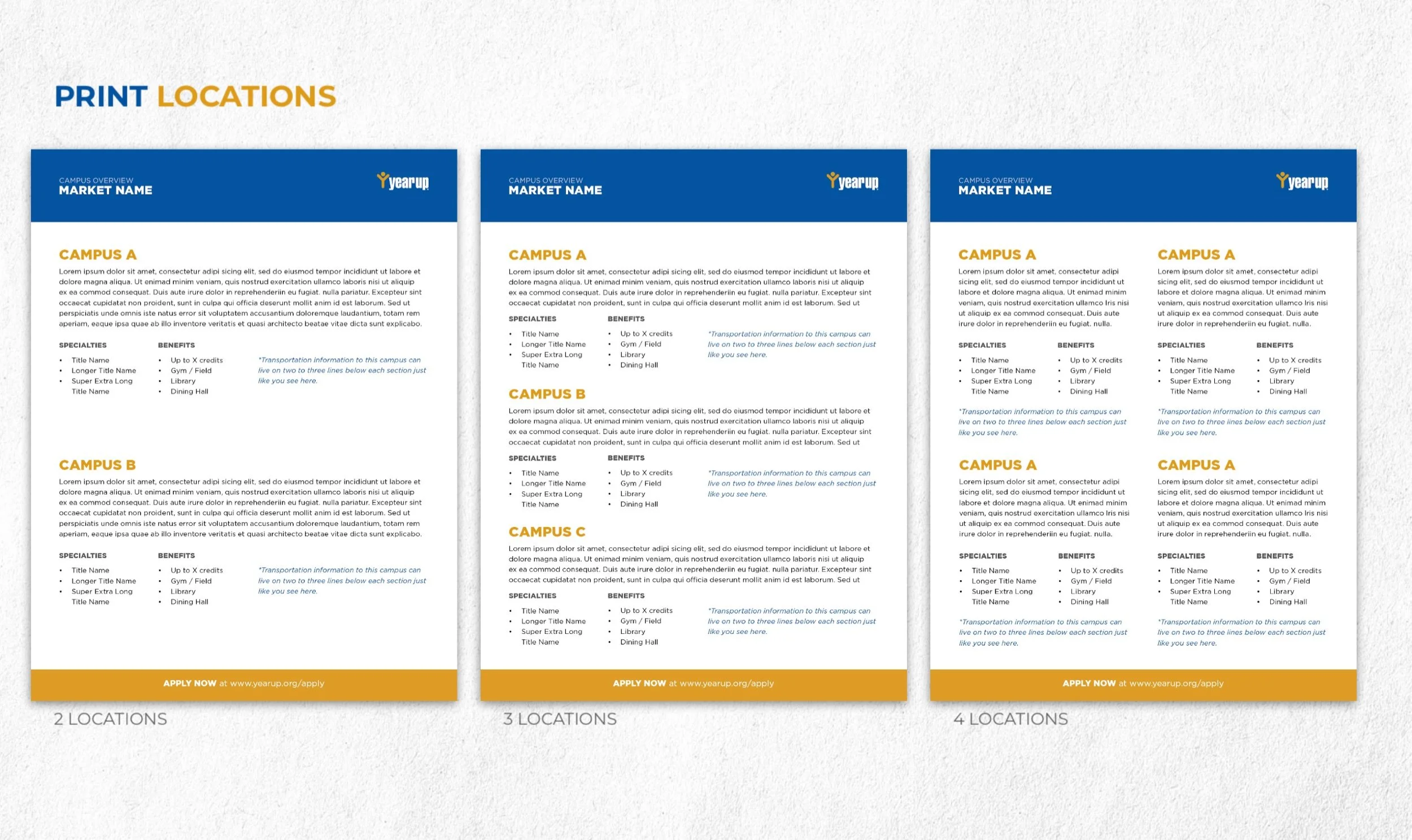
Considering the marketing team’s limited resources, an important feature of this suite is the built-in customization ensuring each market access to all assets as needed. I also included guidelines to help navigate each file.
Reflections
If given the chance to continue iterating on this recruitment suite, there are 3 things I would changes. First, I would migrate these assets to Canva or Adobe Express to allow for more flexibility and accessibility when editing each asset. The reality of marketing departments in the education space is that designers are a luxury to have — it’s common for marketing professionals to wear many hats and mastering design programs isn’t a top priority. Migrating them would ensure that anyone could update each asset for any YearUp market. Second, I would work closer with the marketing team to analyze the performance of past assets and establish a clearer benchmark for success, and propose a testing strategy to ensure the team gets the most out of the redesigned suite. Finally, I’d continue tweaking the designs, making them as easily customizable as possible — again, in anticipation of the marketing team having limited resources.
Contributions
Art Direction, Graphic Design, Project Management
